The Royal Institute of Philosophy — Question everything
Illustration: Beth Walrond
The Royal Institute of Philosophy is the UK’s largest independent charitable foundation dedicated entirely to the advancement of philosophical thought. With a proud history and an ambitious vision, it plays a vital role in promoting rigorous, inclusive, and accessible discussion about life’s biggest questions. Our task was to help the Institute reach further: to raise its profile, celebrate its work, and open up philosophy to new audiences.
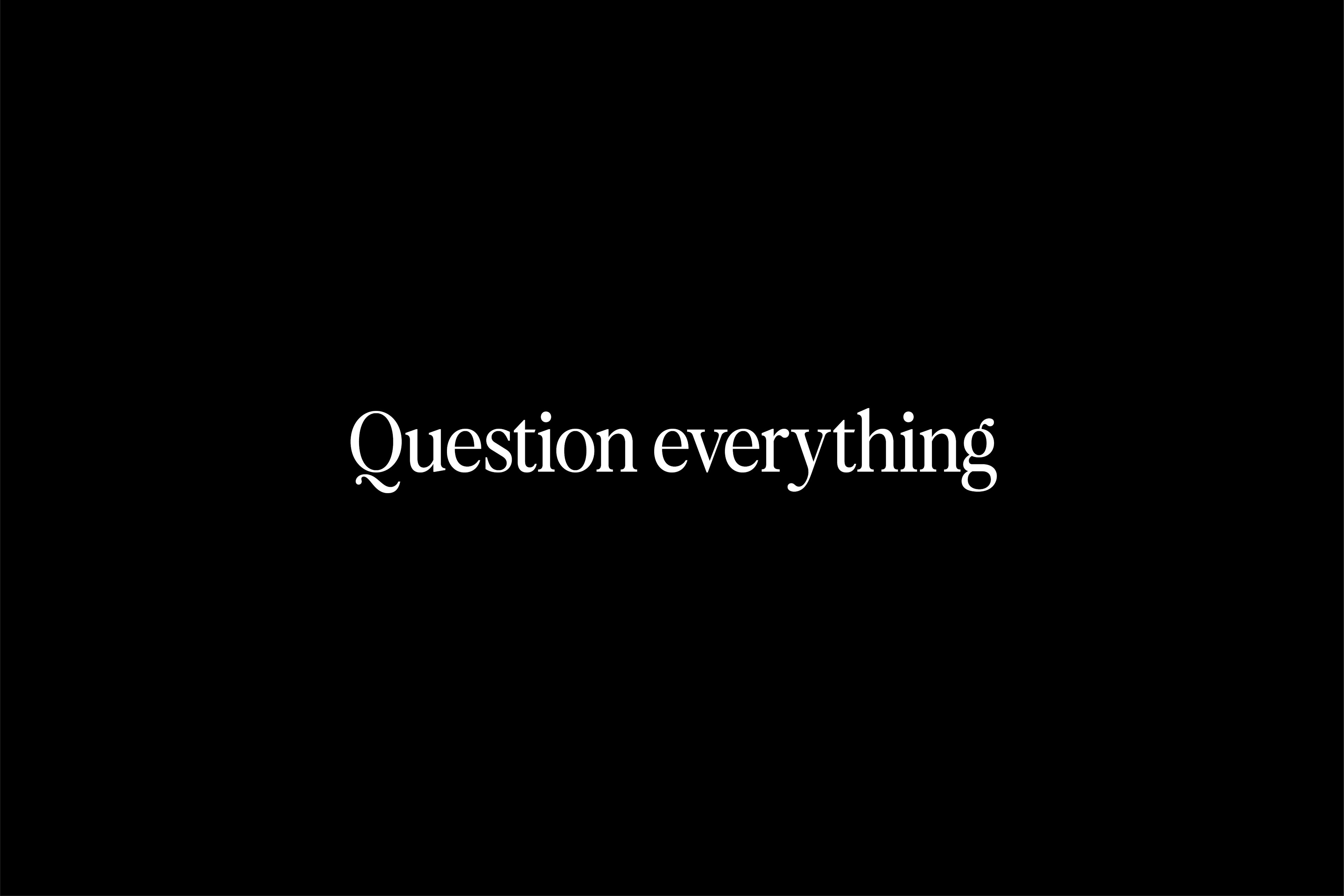
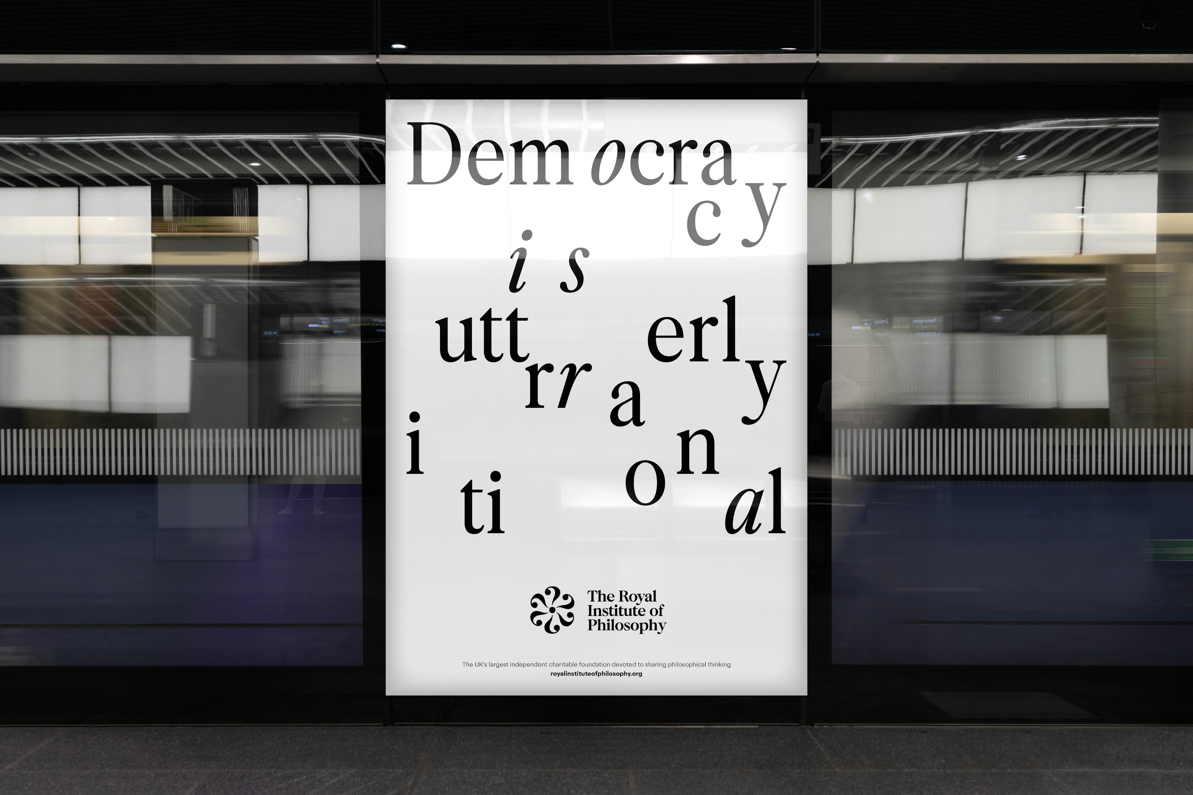
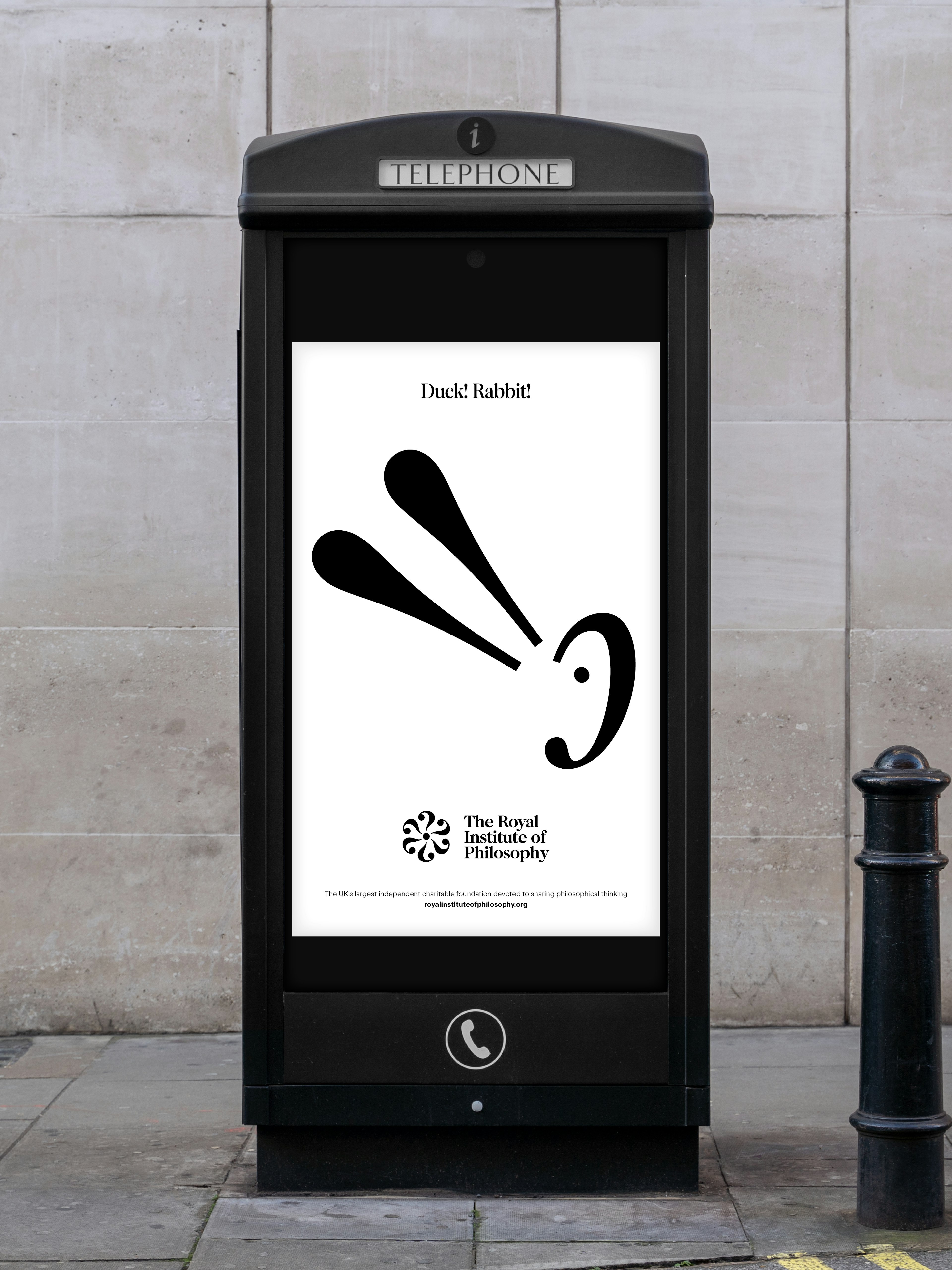
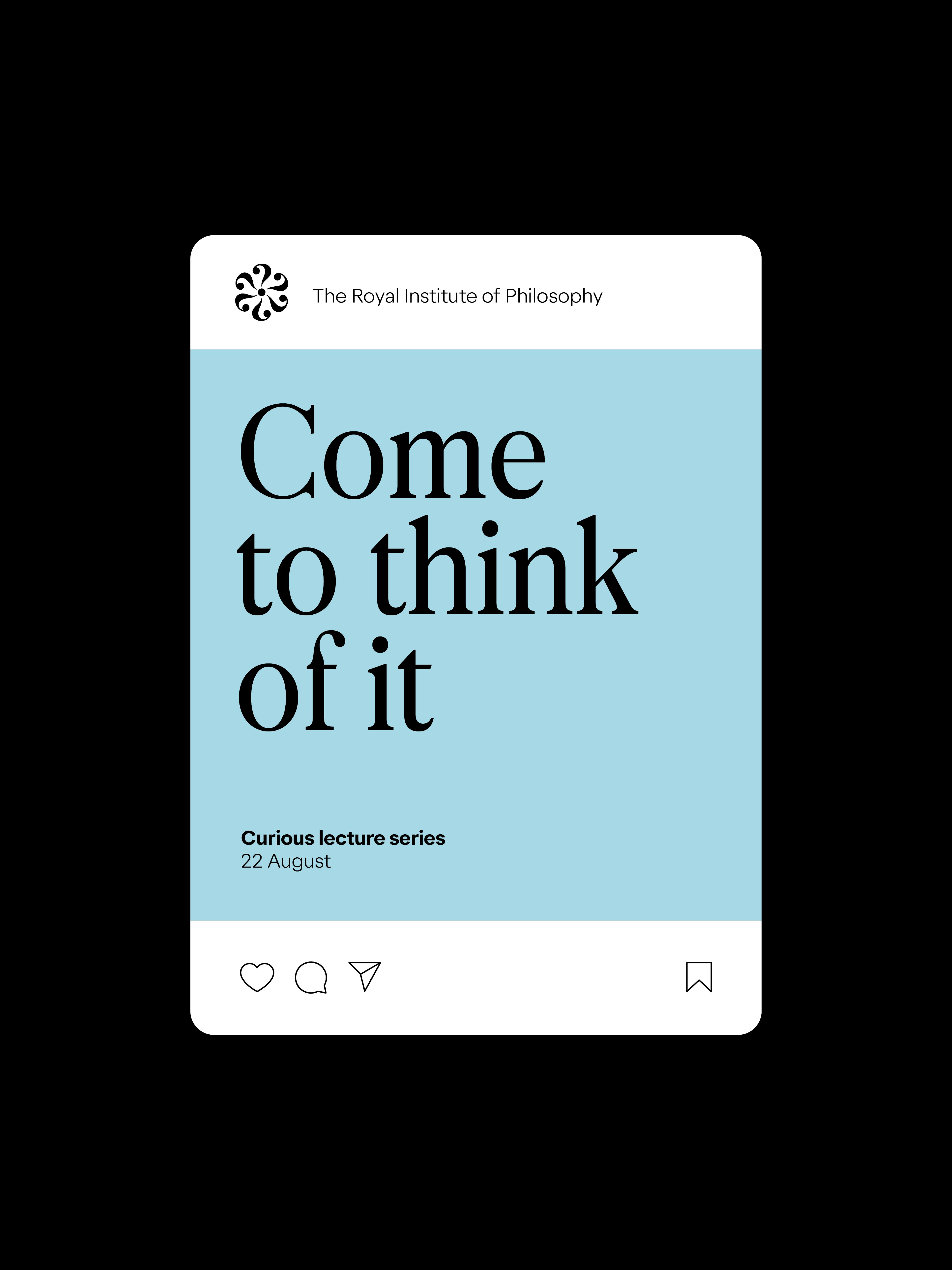
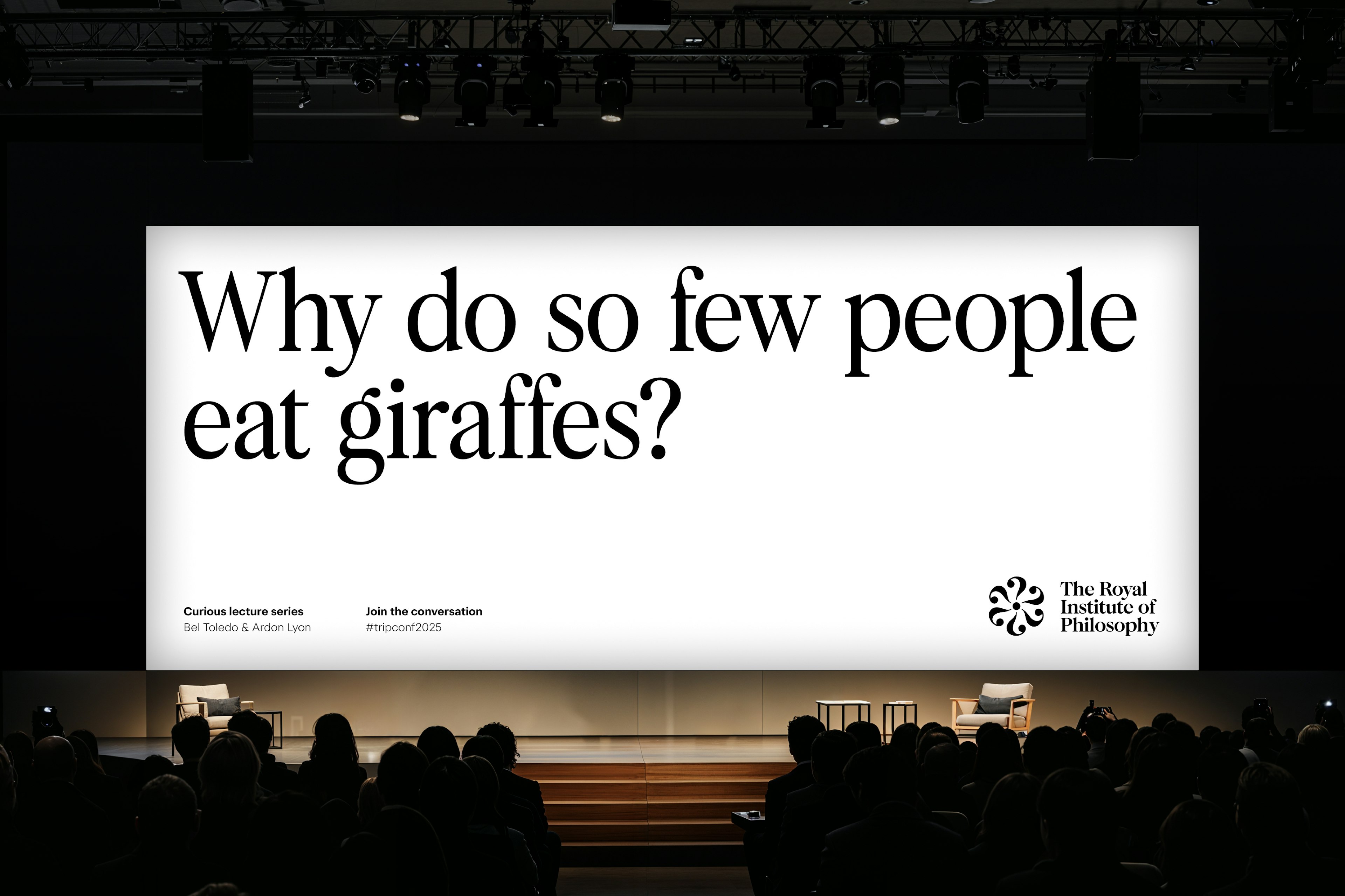
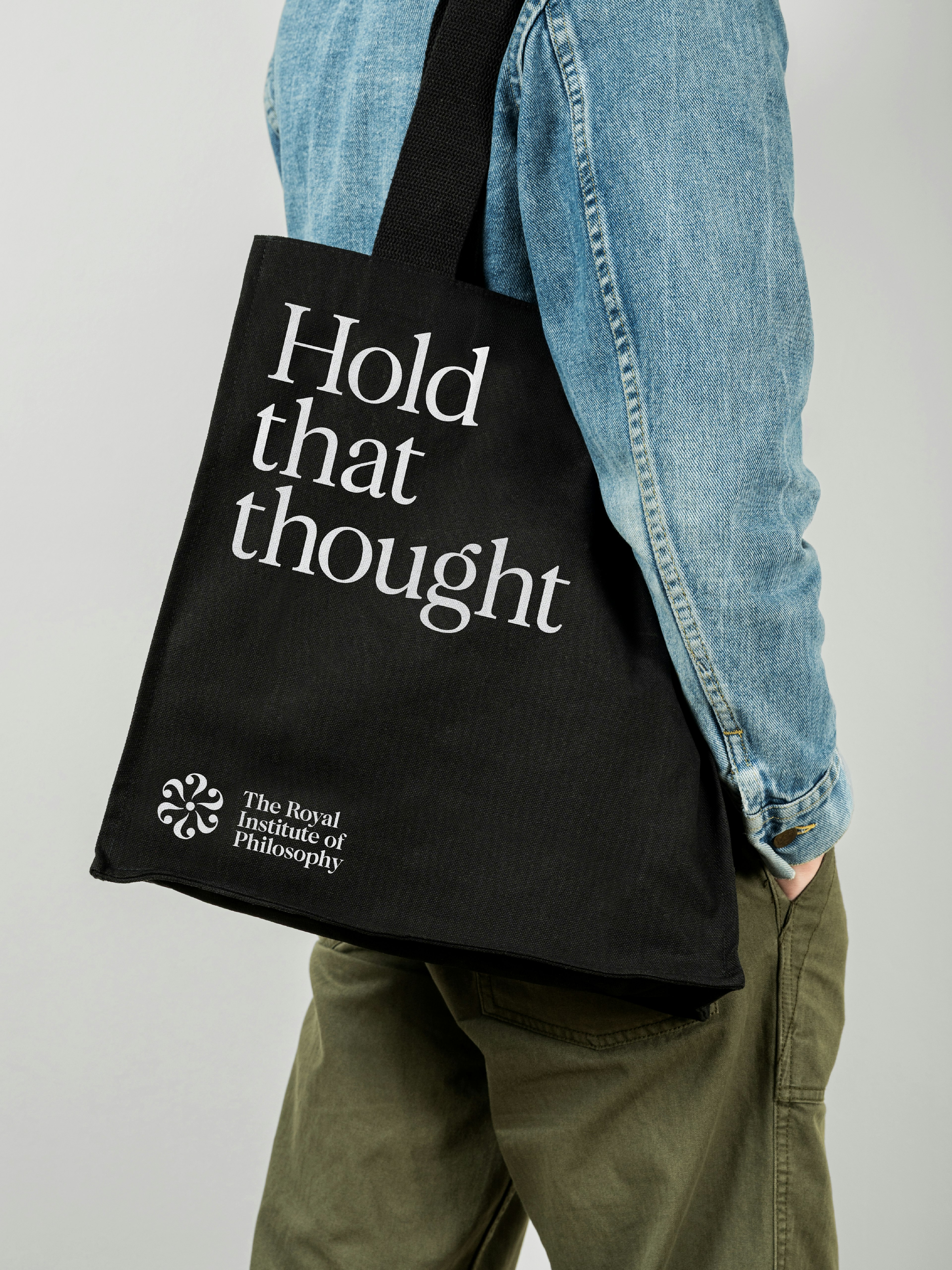
Philosophy starts with a question. “Question Everything” captures that instinct: to be curious, to challenge, to think more deeply. It speaks to life’s biggest questions, and the smallest everyday ones. Designed to provoke and invite, it challenges assumptions about who philosophy is for and what the Institute stands for. By resetting expectations, it positions the Royal Institute of Philosophy as an open, questioning and contemporary force — one that exists to engage new audiences in meaningful, thought-provoking ways.
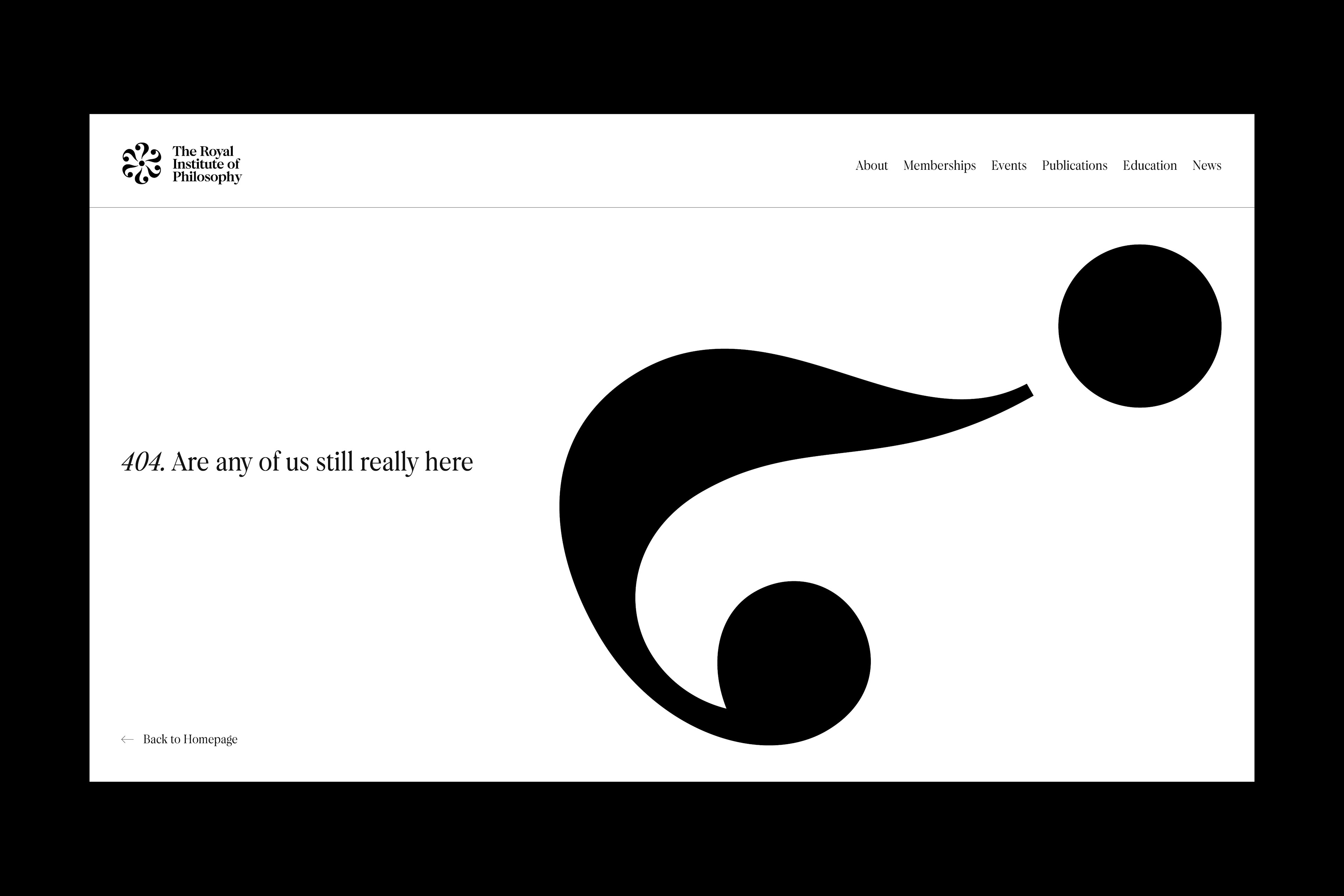
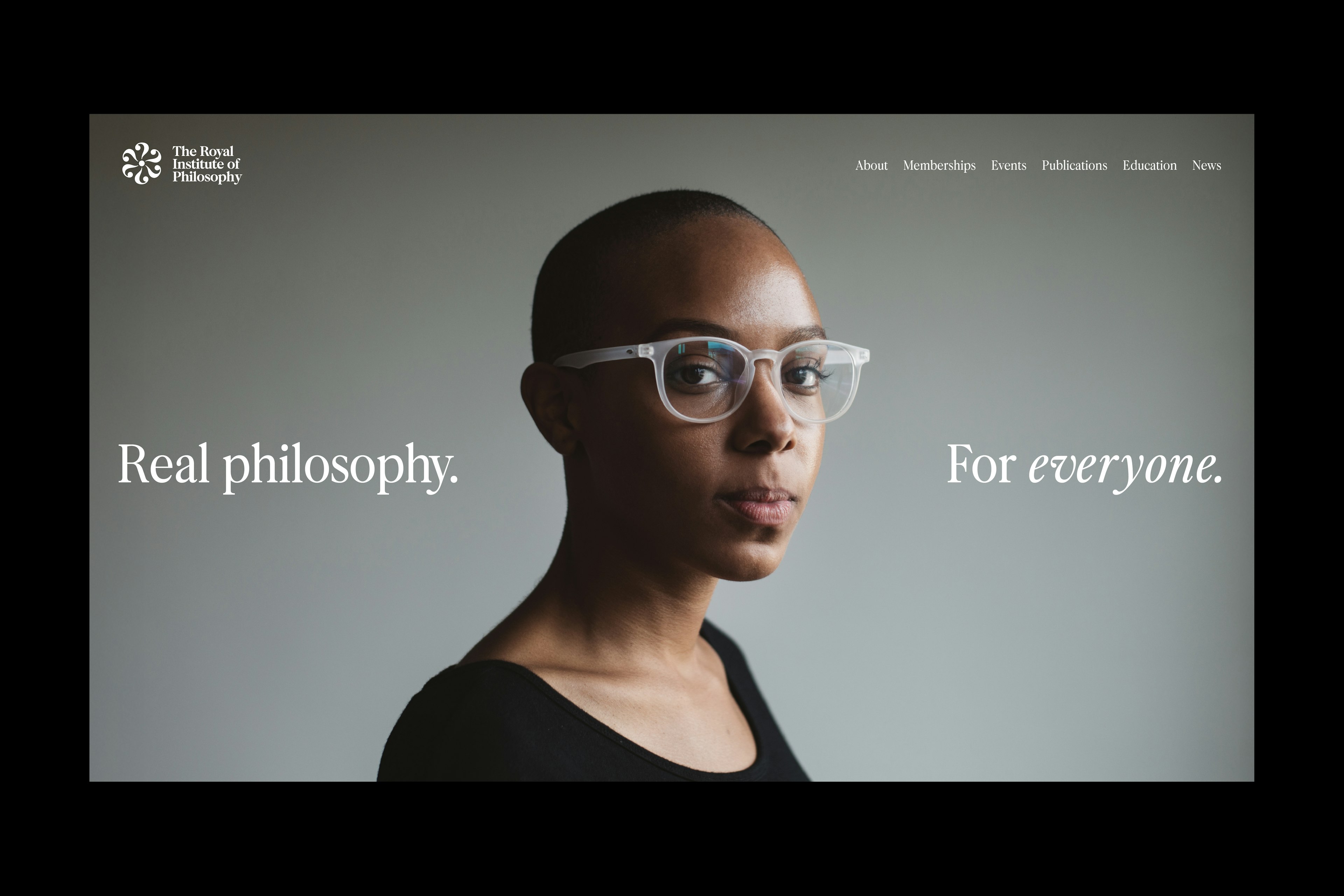
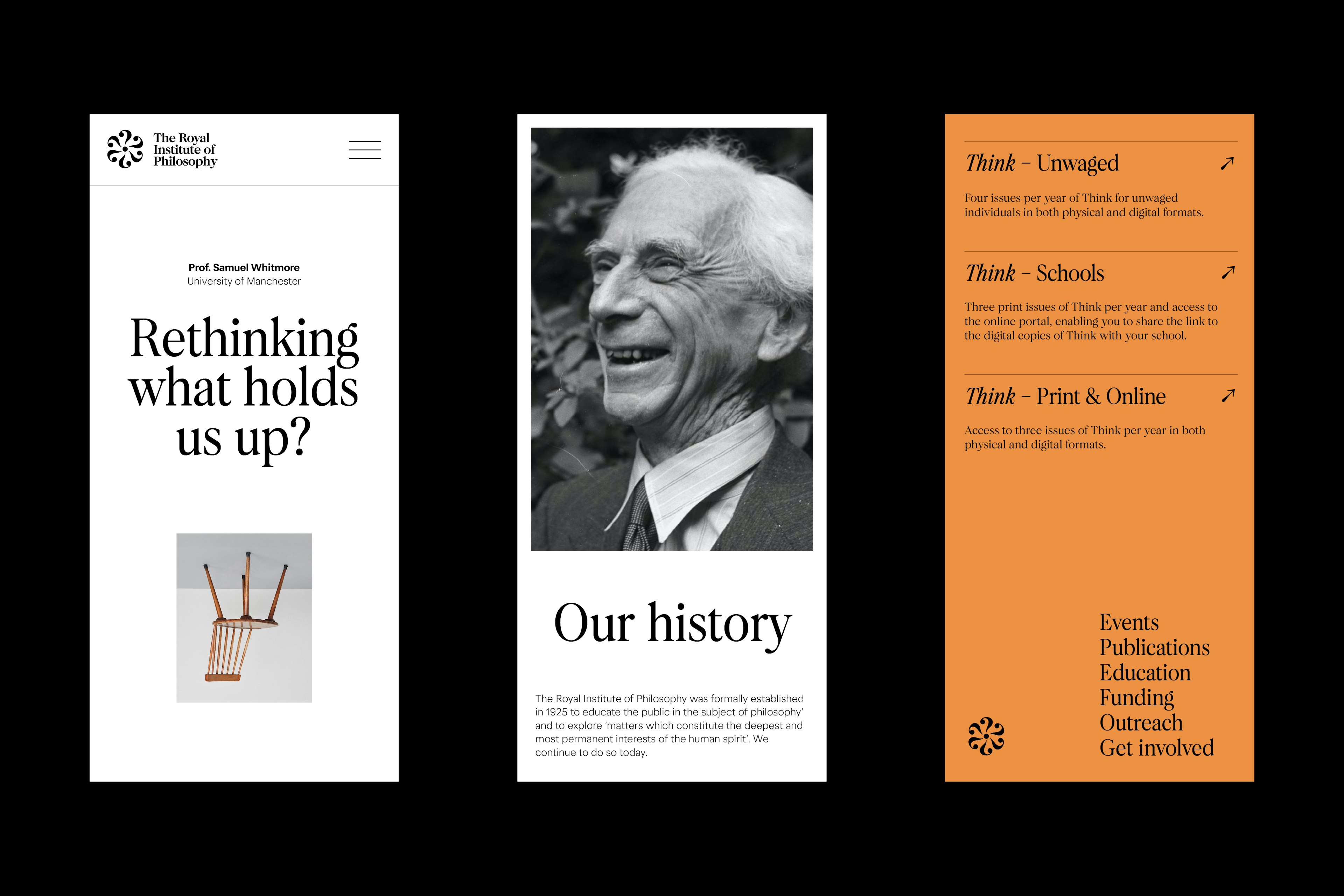
We redesigned the website to make the Institute’s content more accessible, discoverable and global. A clean, timeless layout ensures clarity and ease of use, while enabling rich philosophical material to move beyond print, reaching wider audiences through video, audio and online learning.
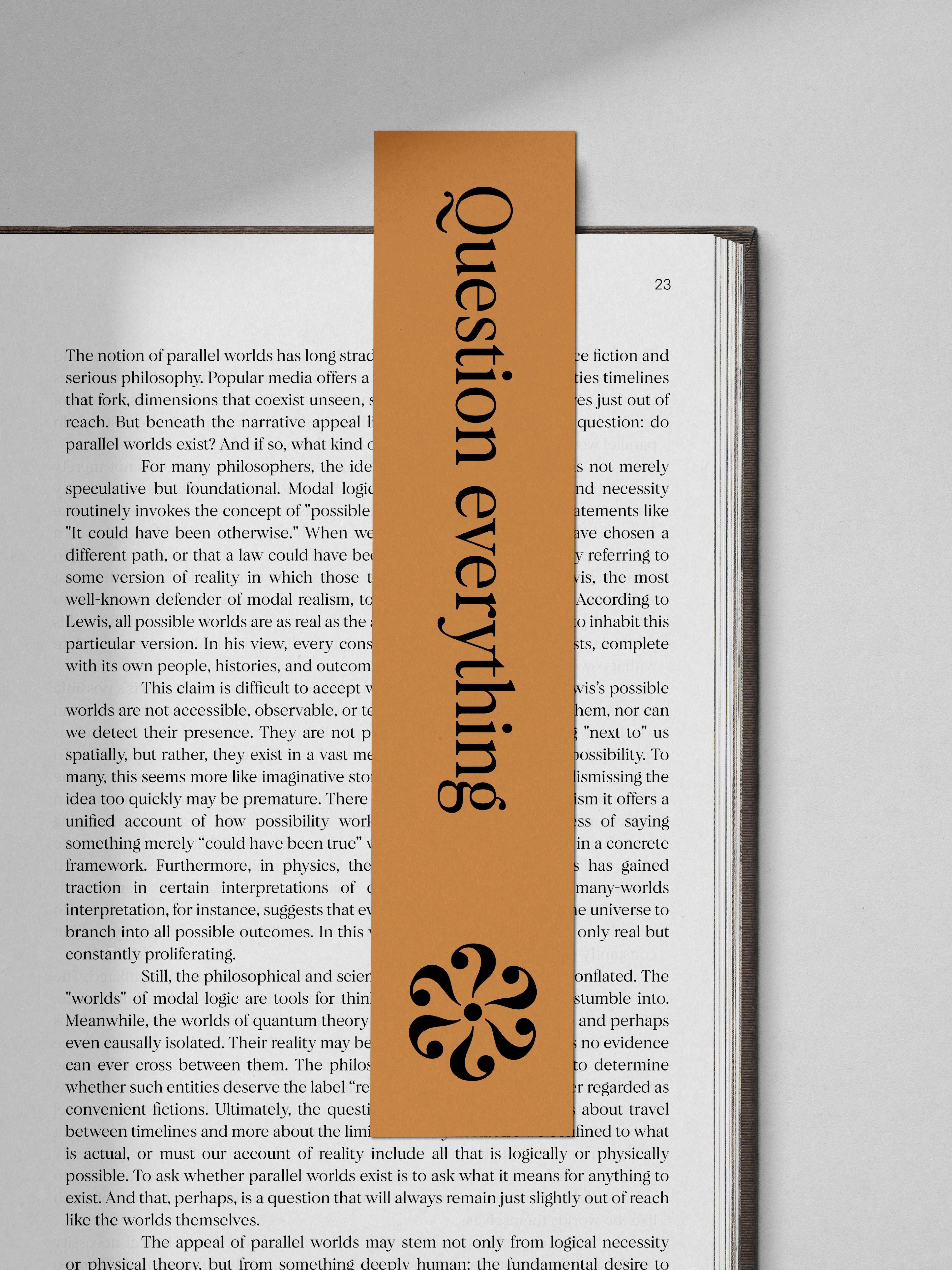
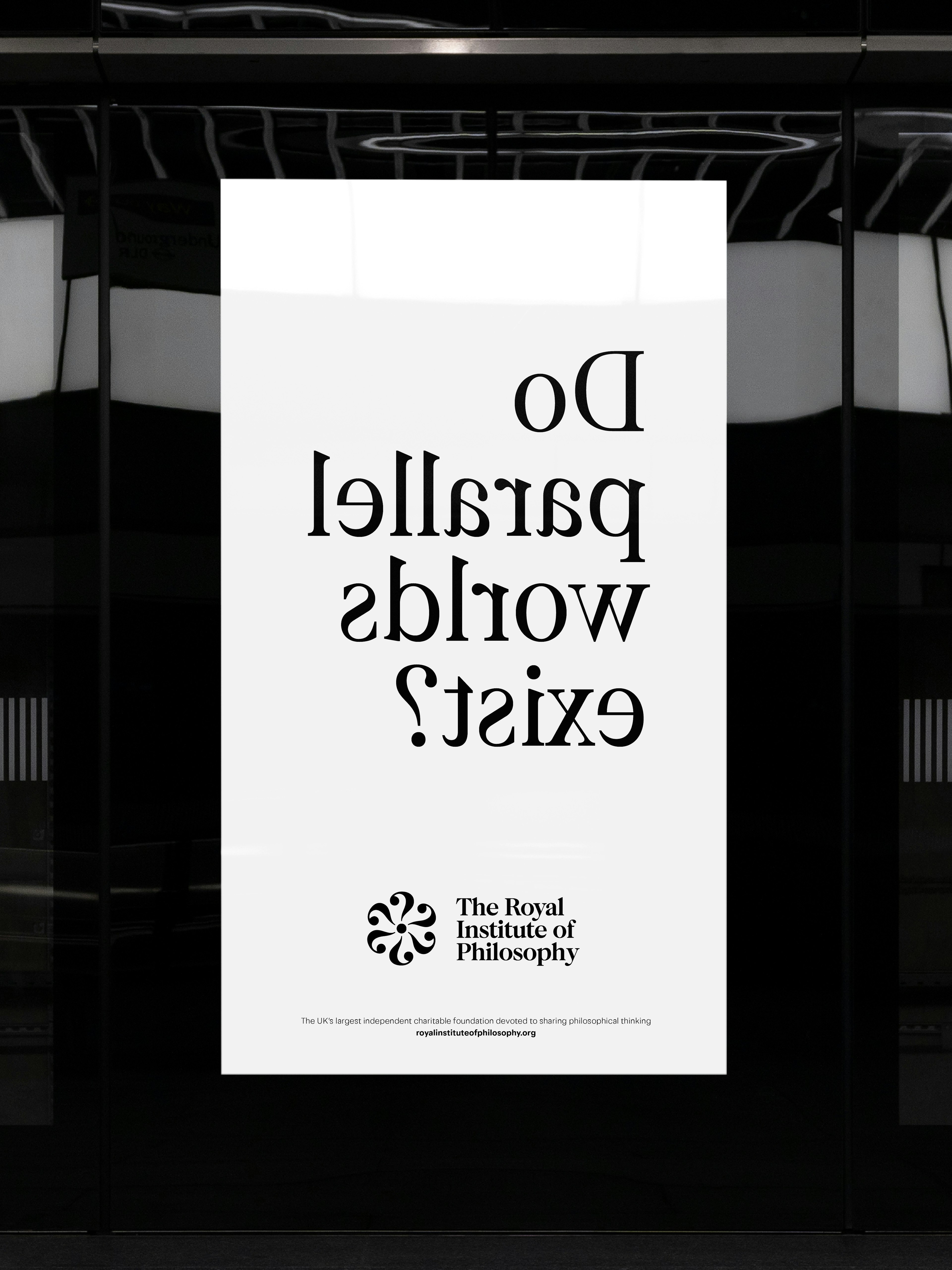
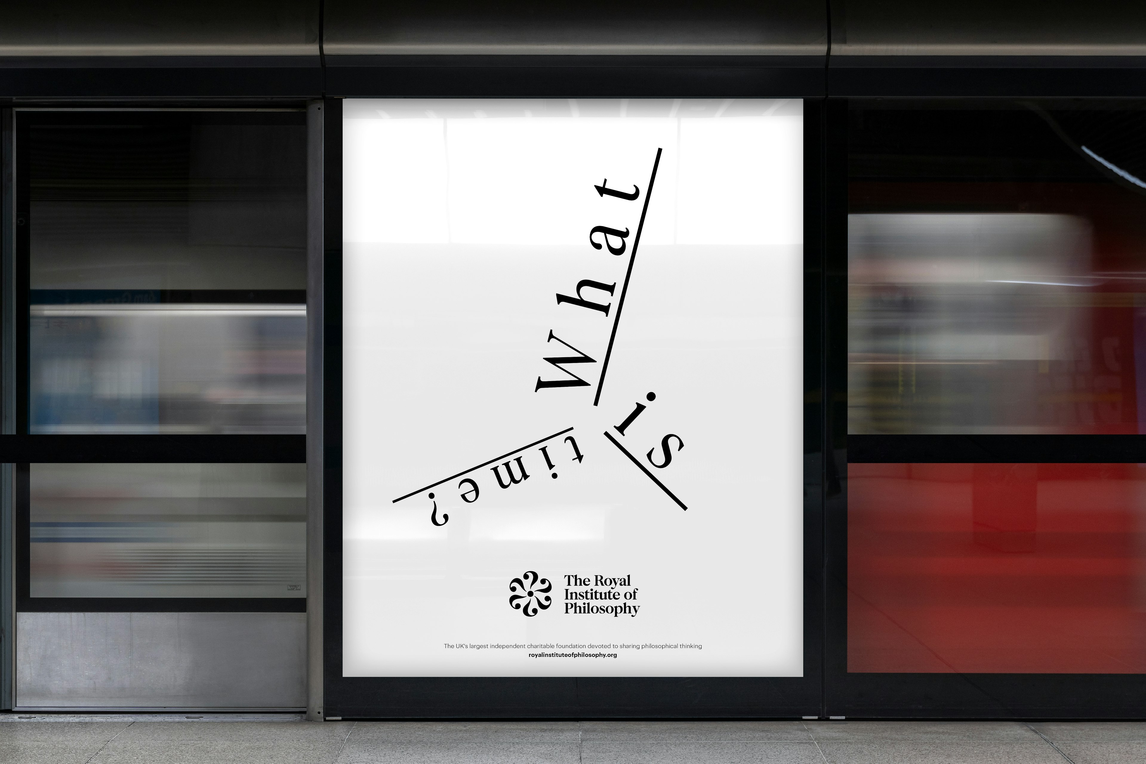
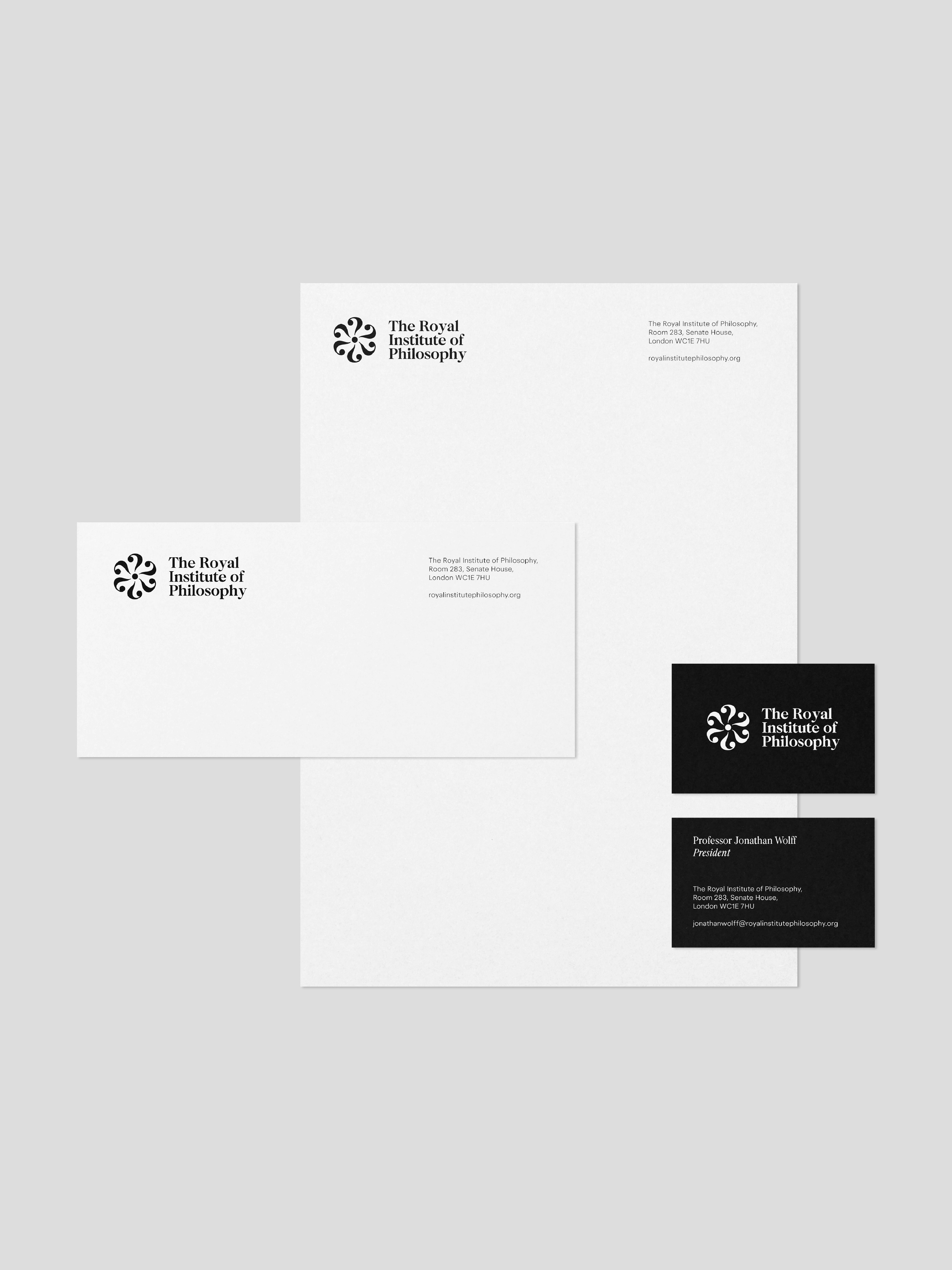
Typography is central to the identity: the primary tool for expressing ideas in philosophy. The type system was designed to feel confident, clear and accessible, while allowing room for creativity and nuance. F37 Calson, a refined serif, brings warmth, readability and a sense of heritage. It’s paired with F37 Blanka, a modern sans, to add contrast and versatility. Together, they create a distinctive voice that balances tradition and modernity, and makes philosophical content feel both serious and inviting.
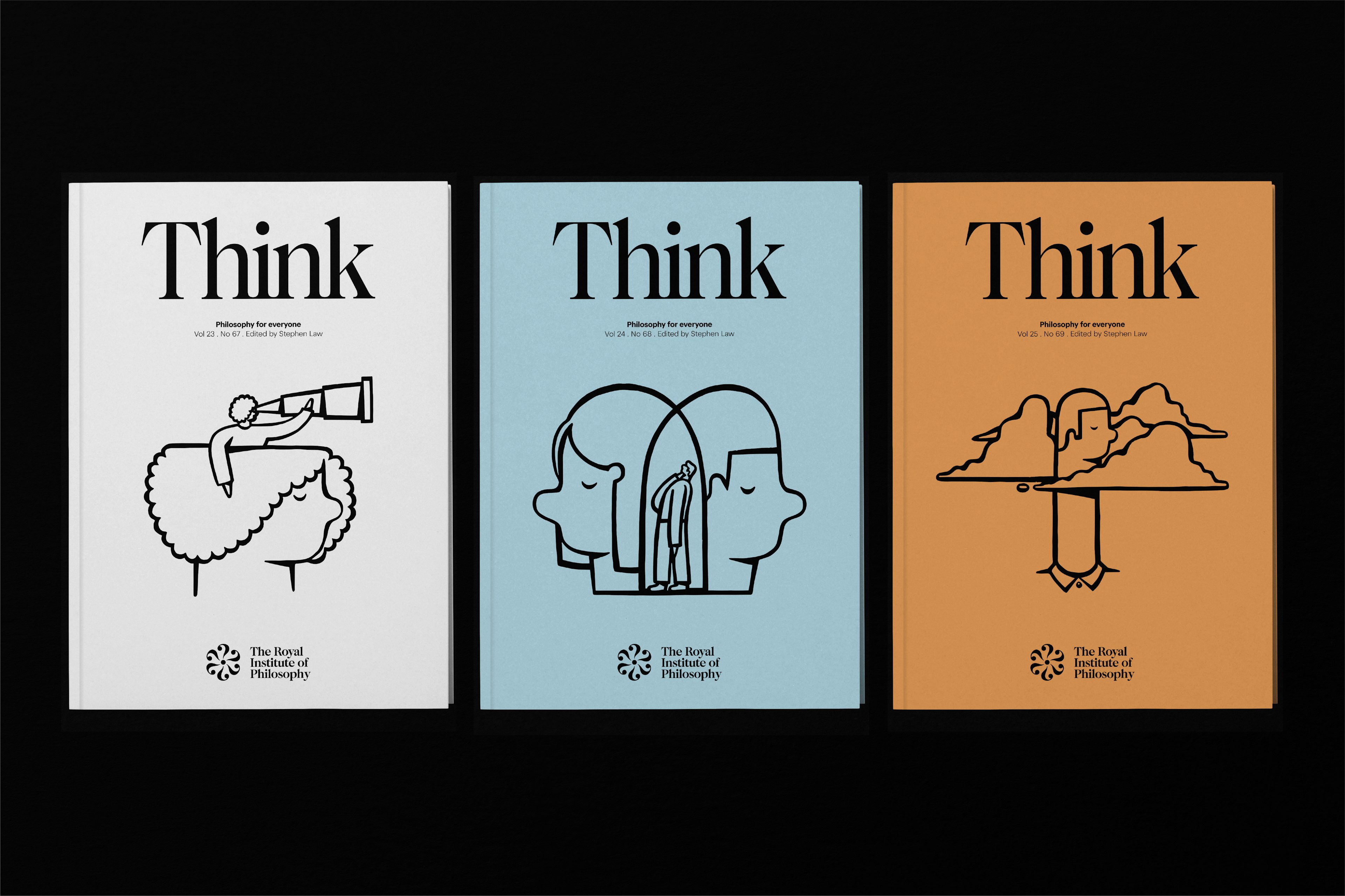
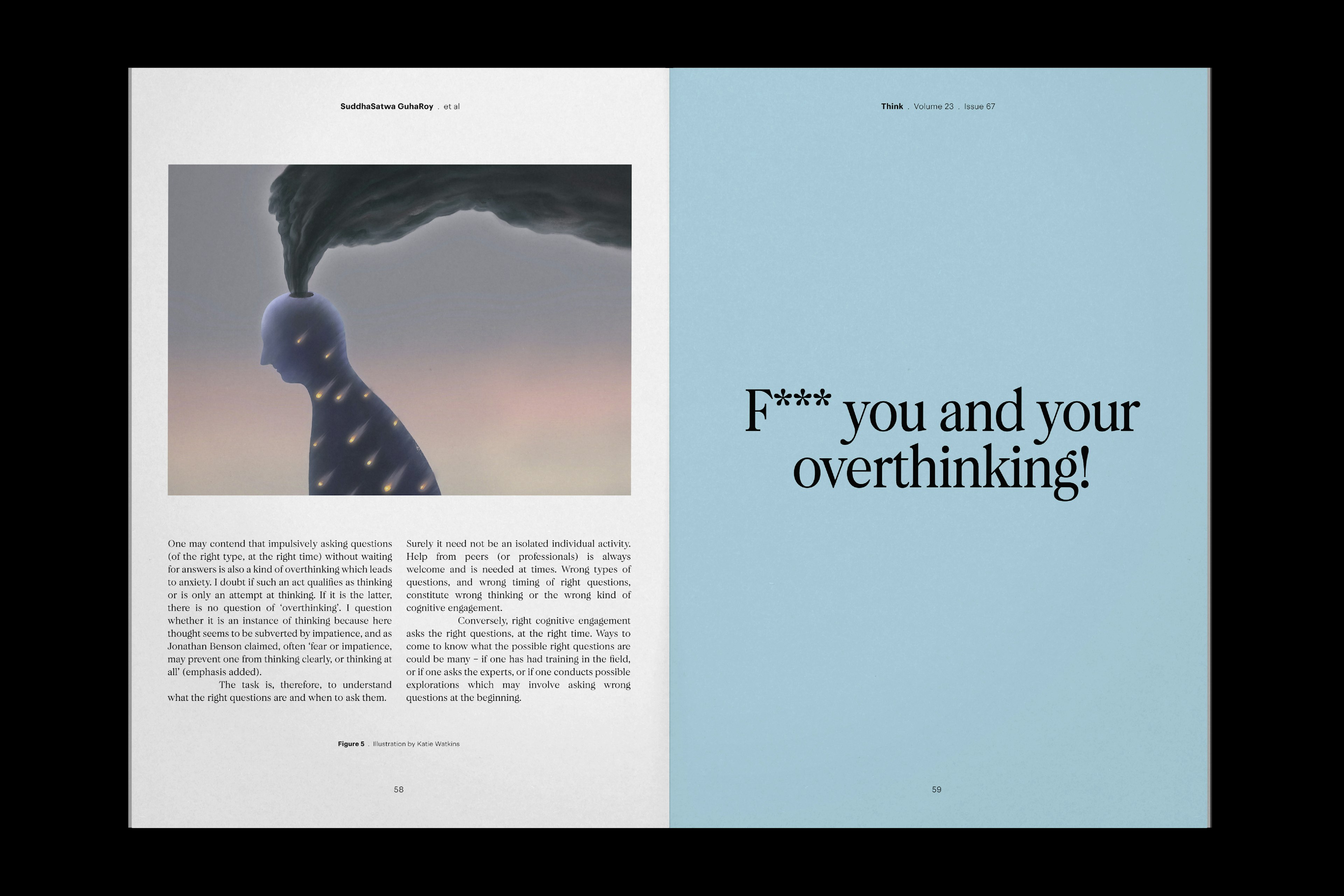
We redesigned Think to reflect its mission: philosophy for everyone. The journal offers accessible but thought-provoking writing from leading philosophers, and the new design brings that spirit to life. Clean, confident typography and considered layouts make the content more inviting without compromising depth. Cover illustrations add a layer of visual interpretation, embracing ambiguity where words alone can’t capture complex ideas. The result is a publication that feels alive, engaging and capable of reaching a broader, more curious audience.
As the Institute approaches 100 years, this rebrand marks the start of a new chapter: more open, more active and more ambitious. With a clearer identity and broader reach, the Royal Institute of Philosophy is ready to bring powerful ideas to more people, in more places, through more formats than ever before.